{{template-name}} Template
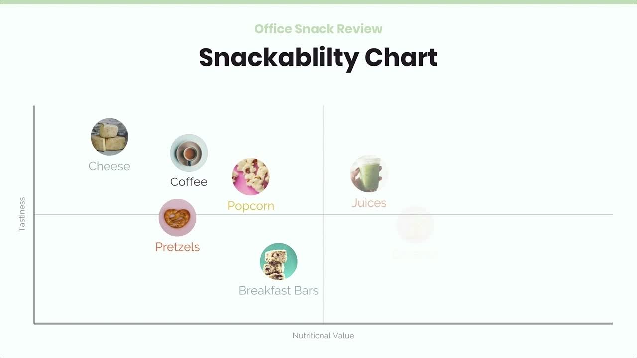
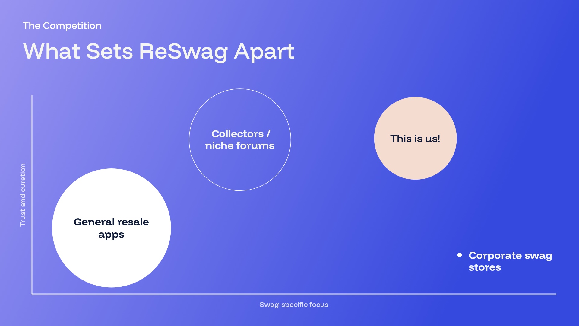
{{template-name}} template styles


What is a {{template-name}}, and when should you use one?
Scattergraphs use dots on a grid to represent relationships or patterns across a data set. A relationship can be positive, where one variable increases as the other does, or it can be negative, where one variable increases as the other decreases.
A scattergraph slide can be used to connect efforts inside your business, such as budgeting to estimate and plan for future expenses. It's also useful for discussing revenue, sales, costs, and other topics common in business presentations.
Use a scattergraph slide template to:
• Show the connection between events or campaigns
• Predict trends based on current data
• Explain progress or changes over time
The result is an editable scattergraph template for presentations, where the design is done and you only add your data.
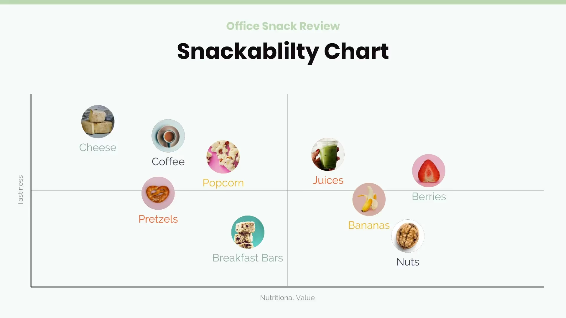
How to use the {{template-name}} Template
Open the template.
Click Use this template and the template opens in the Beautiful.ai editor.
Add your data.
Type your two variables and their data points in, upload a document or data file, or describe it and let AI fill the template.
Make it yours.
Adjust colors and labels to match your presentation; Smart Slides keep the layout aligned as you edit.
Present or export.
Share a live link, present in Beautiful.ai, or export to PowerPoint, Google Slides, or PDF
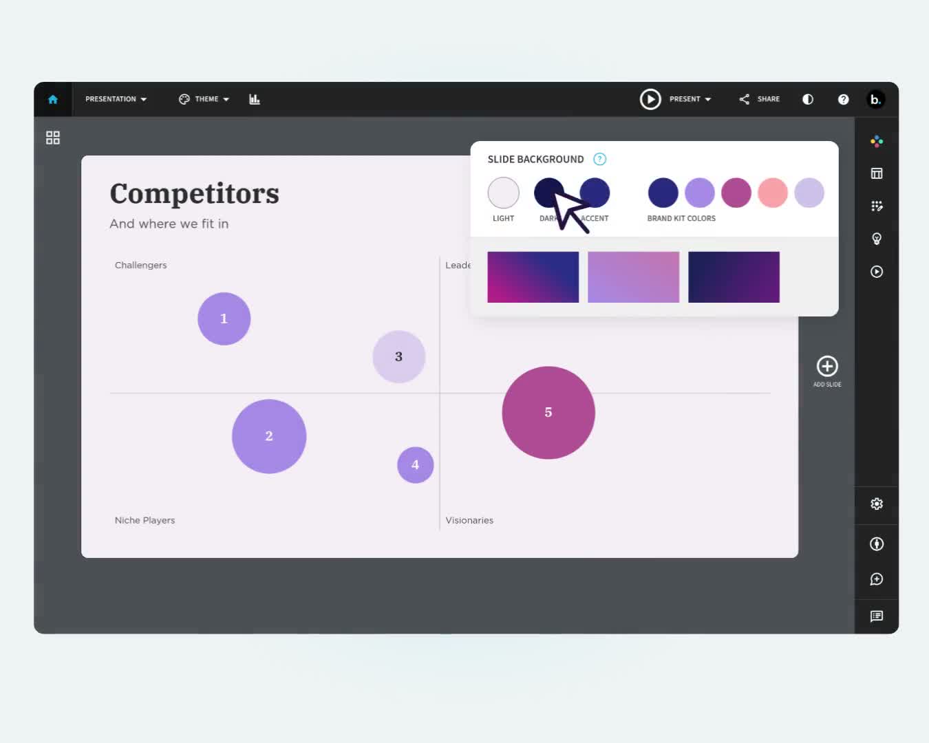
Pro Tips for a Scattergraph Presentation Slide
Consider these tips when adding a scattergraph slide to your presentation.
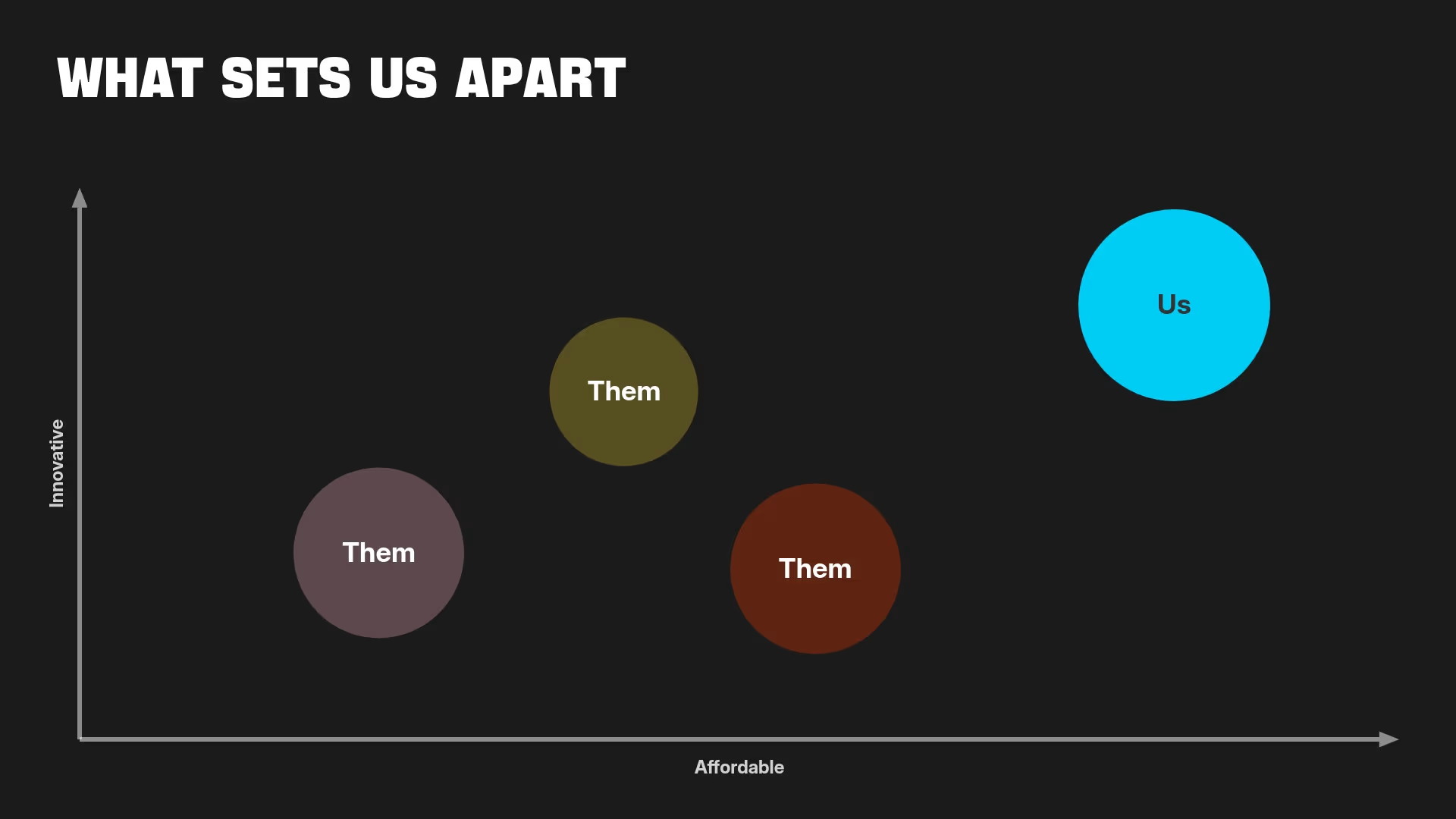
.avif)
If you're using a numerical variable like dollars, choose increments that will display your data well. Increments in tens of thousands may be too large, while increments of fifty may be too small for patterns to emerge.
Your data may have a positive correlation (relationship), a negative correlation, or no correlation at all. If there's no relationship, don't misrepresent your data to say that there is one.
Start your x-axis and y-axis at 0. If you set either axis at a different number, it may skew the way your scattergraph looks.
If your data does have a correlation, add a line of best fit, also called a trend line, to your scattergraph slide. It makes the relationship more visible to your audience.
Discover AI capabilities for scattergraphs
With these AI-driven features, you can build and refine your scattergraph slide in seconds.
Generate an AI scattergraph with a prompt
Add context with AI
Refine copy on a scattergraph slide
Create a supporting image
Browse more templates
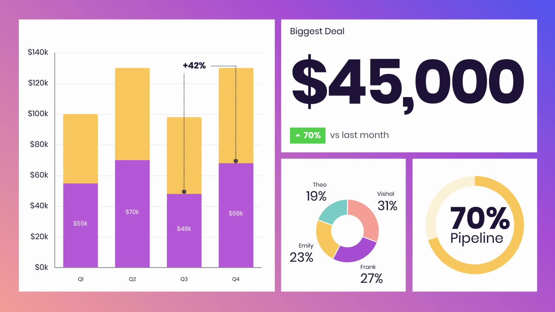
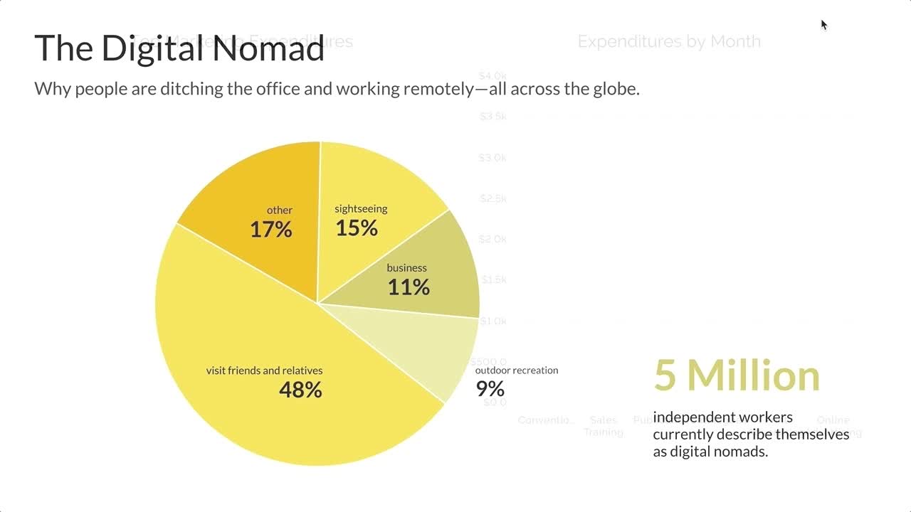
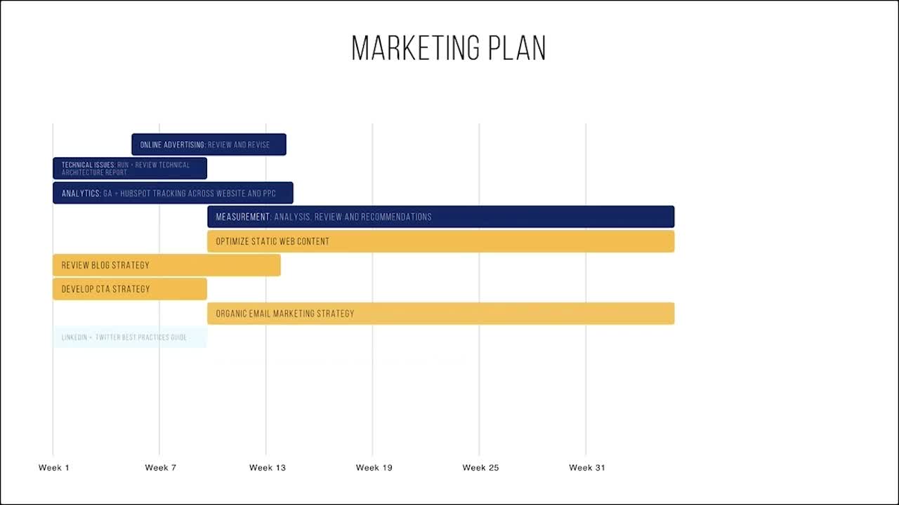

{{template-name}} template FAQ
Lorem ipsum dolor sit amet, consectetur adipiscing elit, sed do eiusmod tempor incididunt ut labore et dolore magna aliqua. Ut enim ad minim veniam, quis nostrud exercitation ullamco laboris nisi ut aliquip ex ea commodo consequat. Duis aute irure dolor in reprehenderit in voluptate velit esse cillum dolore eu fugiat nulla pariatur.
More {{template-category}} templates


AI-powered Smart Slides that do the design for you
Build your next presentation using Smart Slides—the intelligent building blocks behind every Beautiful.ai presentation. Each Smart Slide is customizable, editable with AI, and automatically adapts layout and spacing as your content changes.

“Beautiful.ai helps us quickly create clear and compelling presentations to share our strategy and results. It has been easy to integrate our branding and to pull from the library of materials created by others — building a cohesive and collaborative suite that helps us advance our mission."

"Beautiful.ai increased our efficiency. I mean, 50% sounds crazy, but it's pretty accurate when you consider all of the manual stuff that we used to have to do that Beautiful.ai now does for us."

"What you guys have created is a foolproof way to ensure quality presentations. It's almost just like they have a graphic designer over their shoulder while they're creating their decks."

“For any business owner or entrepreneur where time is of the essence you lose the ability to put those nice touches on presentations, Beautiful.ai does it for you, especially if you aren't creatively gifted!”
Ready-to-use presentation templates for creating full, polished decks.



Pitch Decks


Reports & Reviews


Plans & Strategies
Try it free for 14 days
Start building Beautiful presentations.

